Over Christmas in Richmond the Puchavus ran like a dream. Solid speed, power and scream. A little sparking at the points, but with those rpm's points just aren't going to last too long.
There is nothing like blasting in a city.
Out in Motion Left country 55mph just isn't that fast, but in the city you can rip by people and are easily the fastest thing around. Riding is especially good in Richmond, where mopeds are a common site, and scooters and self-conscious track bikers are everywhere. Cars know how to respond to two wheels. In Indiana all they think of with two wheels are HD's and Hyabusas.
Here is the Puchavus posed by the James River.
Another reason Richmond is infinitely preferable to Northern Indiana is its temperate climate. On this January afternoon I could ride without gloves. Compare this wiping out on a sheet of ice and then being hit by a sliding car (true story). I choose Richmond, plus it's my favorite city in the world, which says a lot seeing as I am writing this in Rome.
I'm thinking of Bilbo Baggins's teapot on the fire right now, and I'm sure it's not going to be for the last time...
Today we visited the Rare Books room of the architecture library and spent about three hours pouring over the newly acquired first editions of Palladio's Quattro Libri De Architectura and Stuart and Revett's Antiquities of Athens.
First edition Palladio rebound in vellum:
First edition Stuart and Revett:
Professor Thomas Gordon Smith with the Quattro Libri: Frontispiece to the second book: Professor Thomas Gordon Smith with The Antiquities of Athens: It was interesting to note Benjamin Franklin's name as a subscriber in the front of Antiquities of Athens. Did a copy of the book make it to America before the revolution?
Polini USA, along with 1977 Mopeds is putting on the Moped portion of the upcoming Polini Cup.
This will be full track racing on a technical paved race course.
The season starts in April. Each race weekend is going to go: practice on Saturday, and race on Sunday. You can get all of your tuning finalized, and become familiar with course on Saturday, and hit it hard the next day.
We will be racing in between heats of Scooter, Goped, and Pocketbike races.
The season winner will be based on a points system. I am including a PDF that is the rough draft of the finer details.
To sum up the rules of your moped however, here it is: It must be in spirit a moped. Twist and go clutch, and be an after market moped engine case, or modified stock case.
The Dates:
April 4th and 5th May 2nd and 3rd June 6th and 7th Sept 5th and 6th Oct 3rd and 4th
Location:
We will be racing at the Tom Dash Memorial Speedway. Also known as Atwater
Who is racing?
Confirmed: 77 Race Team MotoMatic Mopeds Seattle Mopeds Polini USA
Build a bike and ride by yourself, or get your friends together and put together a team. Or just come out a watch. This is going to be the biggest non-rally moped series of the year.
19.MOPED WHEELBASE: OPEN LENGTH: OPEN SEAT HEIGHT: Open MAX HEIGHT: STOCK COOLING SYSTEM: AIR / WATER DISPLACEMENT 2 STROKE:90cc MAX RIM SIZE 17 in MAX RIM WIDTH: OPEN INTERNAL ENGINE MODIFICATION OPEN All modifications must maintain stock appearance Must use stock engine cases, or based on stock Must maintain stock frame Equipped by centrifugal clutch After market exhaust OK
ALL DIMENSIONS SUBJECT TO A 5% TOLERANCE
RR011.2.2 FUEL AND COOLANT As fuel only Lead free gasoline may be used. Liquid of the cooling circuit may only be water with a 2% additive to protect cooling system
RR011.2.3 STOP SWITCH For all classes, a kill switch must be placed on the left or right side of the steering, easily reachable by the riders hand and must securely stop the running engine
RR011.2.4 FOOTRESTS Maximum length of the footrest from the top view is 45mm and minimum is 25mm. Footrests can be the tip up type, but must be equipped with a device that will automatically return them to normal riding position. Each footrest must have an integral ball end with a minimum diameter of 8mm If footrests are not the tip up type they must be coated with a rubber or Teflon cover.
RR011.2.5 BRAKES Motorcycles must be equipped with two independently controlled brake systems. One for the front wheel and one for the rear wheel
RR011.2.6 TRANSMISIONS Transmission rates are not limited. The chain must be covered by responsible way. A chain guard must be fitted in such a way as to prevent any direct physical contact possible from chain run to sprockets
RR011.2.7 NUMBER PLATES The color of the numbers is open but must clearly contrast with the background color. Numbers must be a minimum 6” tall and 3” wide displayed on the front of the vehicle.
Still having trouble with the points arking, but found a loose ground that made a lot of difference. Now at least it isn't misfiring. Went in to the shop around ten last night and after swapping out two stator plates decided that wasn't the problem. By midnight I established a new ground off the lighting coil and the Puchavus came to life. I rejetted to a 92 and set the needle one notch up from the richest setting, which is what Sue is running. I also threw on an air filter just to be safe. This actually pulled out more rpm's so I figure I'm still running a little lean. As a result of inverting the second speed clutch it slips quite a bit stretching the first gear out to a screaming shift. It's a little jittery at the top of 1st gear, but the second gear is smooth all the way through the power band. I can definitely feel it hit a wall at the top end, so I hope with a little more tuning of the carb and maybe a 93 or 94 jet I can see an extra couple of mph's. This is one LOUD bike... You think you're going fast... and then you hit the Simonini's power band!!!
Today I decided to open up the transmission on the Puchavus just to see how much damage there was. I was pretty sure the problem was that one of the clutch ribbons (perhaps the one I had "modified" to engage later) had slipped off and destroyed something important... I was right.
Sure enough this little piece of metal had wreaked havoc upon my main drive gear.
Lots of teeth missing...
Here are the teeth...
So I cleaned out the cases, installed a new main drive gear, which was the wrong size so I had to also replace the gear it meshes with to match.
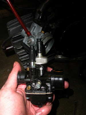
Then I went ahead and replaced my retarded old 19mm Dellorto with the new 21mm PHBG race edition...
After I replaced the fractious second speed clutch I now have a first gear! I also installed it backwards which is supposed to require higher rpm's for it to open... It works!
Definitely sounds like a new bike and put some life into the kit. Now it goes waaaahhhhh!!!! instead of weeneneeeneeeeeee.....
There is nothing meh about the journey of the latest entry in the Collins English Dictionary. Rather, it illustrates how e-mail and the internet are creating language. “Meh” started out in the US and Canada as an interjection signifying mediocrity or indifference and has evolved, via the internet and an episode of The Simpsons, into a common adjective meaning boring, apathetic or unimpressive in British English. The word was chosen over hundreds of others nominated by the public for inclusion in the 30th anniversary edition of the dictionary, to be published next year. Jargonaut, frenemy and huggles were among entries suggested to the Word of Mouth campaign, run in conjunction with Waterstone’s. The panel that made the final selection chose meh because of its frequent use today. Meh was submitted by Erin Whyte, from Nottingham, who defined it as “an expression of utter boredom or an indication of how little you care for an idea”. The dictionary will say that meh can be used as an interjection to suggest indifference or boredom – or as an adjective to say something is mediocre or a person is unimpressed. Collins has been aware for some time of the growing use of meh in written and spoken language. The word is widely used on the internet and is appearing in British spoken English as well as in print media. Cormac McKeown, head of content at Collins Dictionaries, said: “This is a new interjection from the US that seems to have inveigled its way into common speech over here. “It was actually spelt out in The Simpsons, when Homer is trying to prise the kids away from the TV with a suggestion for a day trip. They both just reply ‘meh’ and keep watching TV; he asks again and Lisa says, ‘We said MEH! – MEH, meh!’ “Internet and e-mail are playing a big part in formalising the spellings of vocal interjections like these. Other examples would be hmm and heh, which are both now ubiquitous online and in e-mails. People are increasingly writing in a register somewhere in between spoken and written English.” Elaine Higgleton, the editorial director at Collins Dictionaries, said: “We ran this campaign to encourage the public to tell us about the words that they use every day, but that aren’t in the dictionary. “We want to make sure that Collins dictionaries include everyone’s words.”
I have been asked to design an office building in South Bend for my studio project. The facade (let us not speak here of the plan...) has taken many forms.
So I decided to approach this in a Westallian manner and asked myself which of the six types an office building fell under.
My conclusion was that the office building is almost directly related to the:
Here is a really good regia:
So while I was flipping through books I forgot that I was supposed to be designing a regia and was like oh look at those arches.... cool.... I'll take those. (They are pretty nice.)
Then I got really side-tracked looking at some of the architect Louis Sullivan's work. I thought that a Logia on top of a low rise building would be wonderful, and remembered seeing something like that somewhere.
Using Lheureux's arches my loggia and Sullivan's tall building I wipped up this design:
But then I realized Sullivan was a complete moron (as you can see in this picture), and through out all his nonesense.
I decided to turn instead to somethign grounded in good architecture, and who better than Vignola? I found this Palazzo by Vignola to be especially interesting because it was declaring itself to be a three story building while actually containing seven or more floors. Remember a regia shouldn't be any more than three floors, even for a prince.
I also realized that I didn't like Lheureux's arches in this project after all. They seemed a bit too Beaux-Artes. I needed something more graceful and airy for the top of the building....
Something like this:
However, it needed to have at least a little bit of strength at the corners so I looked around and found this beautiful loggia and fell in love.
The Loggia Rucellai:
This is what I arrived at:
The middle section, however, became very difficult. I decided to use superimposed orders like at the Colosseum:
But only in the middle section between the two loggias, as at the Palazzo Farnese at Piacenza:
This is what it looked like:
But was this just too many columns? and was I following the typology of the regia too literally?
Apparently not.... Here is a strait up little Palazzo two blocks from my site.... And nothing I could come up up with could rival the level of ornamentation of the South Bend court house.
Palazzo Indiana: It's quite good! minus the windows...
Next I wondered what would happen if I combined the loggia as a single element with the columner center:
I drafted this up with a great deal of puzzlement due to the window placement:
But this just didn't work. It was too vertical. The base I had added provided more ceiling room for the shop fronts, but made the entrance portico too formidable. So I scratched the base and moved the loggias back to the sides. This is what the revised facade looked like:
After I had finished congratulating myself on such a wonderful solution I realized that I had arrived at a giant wedding cake (or tick-tack-toe board as my professors were so quick to point out).
I had to get rid of the layered and overly tripartite appearance, but I was running out of ideas. then I ran accross McKim, Meade and White's Tiffany's in New York, and noticed how they had proportioned the upper entablature to fit the whole top two stories and heightened the base:
What a wonderful building!
I quickly sketched out a corner with a larger cornice:
But this too didn't quite work out. There was too much going on. As Professor Economakis says, "A building can only handle one good idea." There were too many ideas, each good on their own, but together creating an ugly jumble. There was too much top and not enough middle too much centrality and not enough fucus. And so I continued to look through McKim, Meade and White. Here surely I could find one good idea that would answer my question.
Blam!
Not My favorite building, but at least one that directly answered my problem... (Notice the strenth of the corners.)
And so I quickly heightened the middle, reduced the loggia height, increased the cornice to fit the whole upper portion (above the rusticated base) and eliminated Vignola's columner center.
Who knows where this will lead tomorrow, but for the moment I still have a building that reads as three, if not floors, at least rememberances of floors, with a light, graceful loggia at top, a powerful, unifying cornice, rusticated base with a grand, but not too formidable portico. (Oh, and ignore the tripartition, I'm still not able to let myself erase it.)
They look to be in excellent condition. Apparently Motion Left has found a new welder who can add a lot of material reliably without warping the cases. As I will be running the large transfer Metra a lot of material will be needed just to match the transfers as well as to provide a sealing surface.
Here's the Parmakit race crank I will be using:
Not stuffed but these cranks are apparently bullet-proof. Needle bearings etc. Only downside is I have to find a weird sized bearing for the clutch side.
Here's the first picture of the Puchavus in a while. It still has the Za50 on it right now with a retarded old untunable Dellorto 19mm. It was still seeing low fifties at BroBQ, but was overheating like crazy and then blew up the transmission.
I just got E50 cases this weekend. Goodby 200 part engine, Hello 20 piece work of art!
Ready to Be Built: 80cc Large-Transfer Metrakit (with chip out of skirt...)
Giambattista Nolli (1701-1756) was an architect and surveyor who lived in Rome and devoted his life to documenting the architectural and urban foundations of the city. The fruit of his labor, La Pianta Grande di Roma ("the great plan of Rome") is one of the most revealing and artistically designed urban plans of all time. The Nolli map is an ichnographic plan map of the city, as opposed to a bird’s eye perspective, which was the dominant cartographic representation style prevalent before his work. Not only was Nolli one of the first people to construct an ichnographic map of Rome, his unique perspective has been copied ever since. The map depicts the city in astonishing detail. Nolli accomplished this by using scientific surveying techniques, careful base drawings, and minutely prepared engravings. The map's graphic representations include a precise architectural scale, as well as a prominent compass rose, which notes both magnetic and astronomical north. The Nolli map is the first accurate map of Rome since antiquity and captures the city at the height of its cultural and artistic achievements. The historic center of Rome has changed little over the last 250 years; therefore, the Nolli map remains one of the best sources for understanding the contemporary city.The intention of this website is to reveal both the historical significance of the map and the principles of urban form that may influence city design in the future. During the last half of the 20th century, architects and urban designers have shown a renewed interest in what the Nolli map has to offer, leading to new urban theories and a model for the study of all cities
Features of the Nolli Map
The Nolli map consists of twelve exquisitely engraved copper plates that measure approximately six feet high and seven feet wide when combined (176 cm by 208 cm). The map includes almost eight square miles of the densely-built city as well as the surrounding terrain. It also identifies nearly two thousand sites of cultural significance. Nolli’s map is an extraordinary technical achievement that represents a milestone in the art and science of cartography. Modern surveys and sophisticated satellite images have confirmed the accuracy of Nolli’s map within the very smallest margin of error. The map not only records the streets, squares and public urban spaces of Rome, but Nolli carefully renders hundreds of building interiors with detailed plans. The detail of the map representation ensures the map's continuing value as a unique historical document, and it gives the viewer a glimpse into the ancient metropolitan center during one of its most illustrious periods.
“A wild tale has long circulated about a giant specter seen by mountain climbers on the Brocken, a German mountain. As the story goes, there was once a climber working his way along the precipice who suddenly saw an immense human figure rise out of the mists toward him. In his fright he lost his footing and fell to his death. Doubtless this is just a story, but the Brocken specter does exist, not only in Brocken but wherever shadows are cast upon mist, fog, and fine water droplets” -Willim R. Corliss, from The Handbook of Unusual Natural Phenomena.
From Great Disasters and Horrors in the World's Historyc. 1890
Interestingly, the Brocken figures prominantly in Goethe's Fauste when Mephistophales and Faust are led by a humunculus to Walpurgisnacht on the Brocken.


 So while I was flipping through books I forgot that I was supposed to be designing a regia and was like oh look at those arches.... cool.... I'll take those. (They are pretty nice.)


 I quickly sketched out a corner with a larger cornice:


